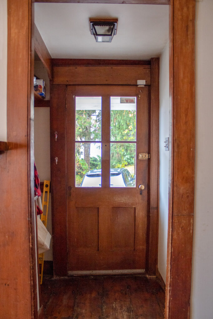
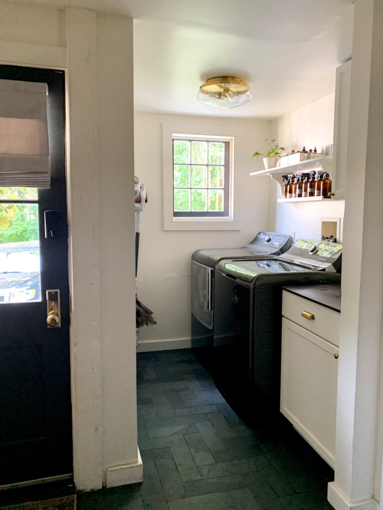
The first project we started in the house was the mudroom. Seems a bit low on the priority list, but there’s a few reasons why we made this priority.
1. It’s our main entry into the house from our driveway.
2. I really like doing laundry in my own home and not hauling everything to the laundromat.
3. Most important… there were FIVE doorways in this little space. Seriously… FIVE. And they needed to go.
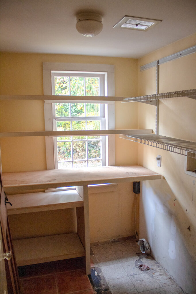
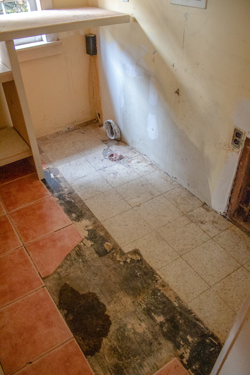
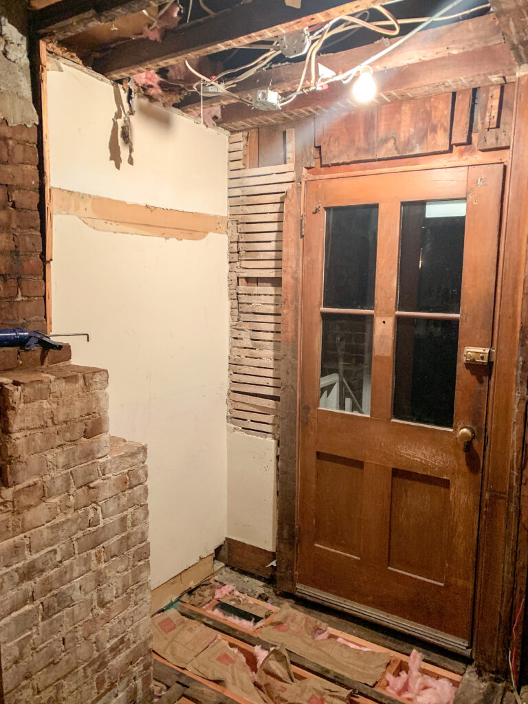
I am NOT an open concept person. I like each room having it’s own space and the ability to close it off, but this mudroom/utility/laundry area was a bit ridiculous. Impossible to capture a photo of the entire space as one, the combined area is only 8′ x 12′, so to have FIVE doorways seemed a bit absurd. Adam started demo and saw that each door had been shrinking in size over the years. As in, framing in smaller doors multiple times! Why were they making the doors smaller over the past 230 years?! Two of them were only 25″ wide. Some things we will never know.
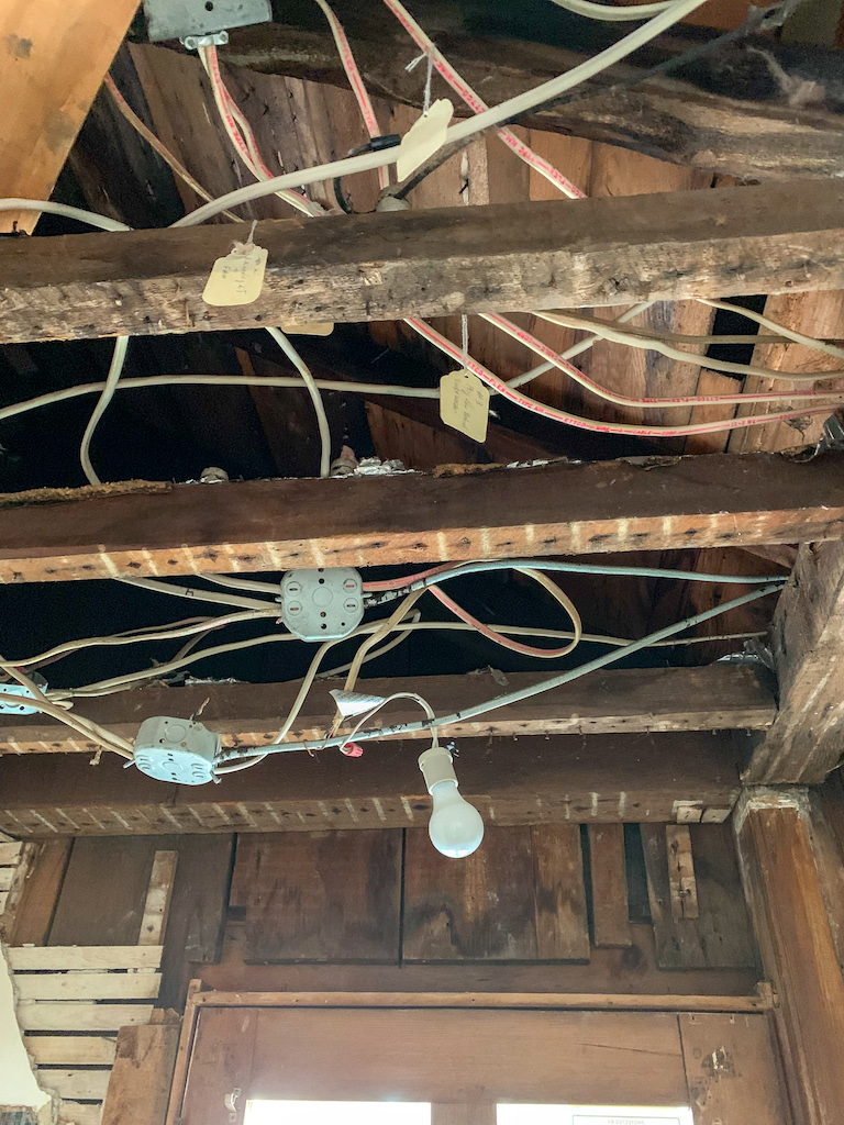
And all but two doorways were unnecessary – the actual exterior door and the door to the in-law suite. Oh, and we couldn’t fit our washer and dryer in, or the existing washer/dryer out (and they were small), so there’s that. Aside from being filthy and impractical, it was a matter of redoing some structural, plumbing and electrical, all new drywall, new tile, paint – you know, everything. What lies beneath was a lot more involved than what we expected, which is kind of what we expected. There is a crawl space under this area that had zero insulation and it was clear the plumbing pipes had frozen several times. No more!
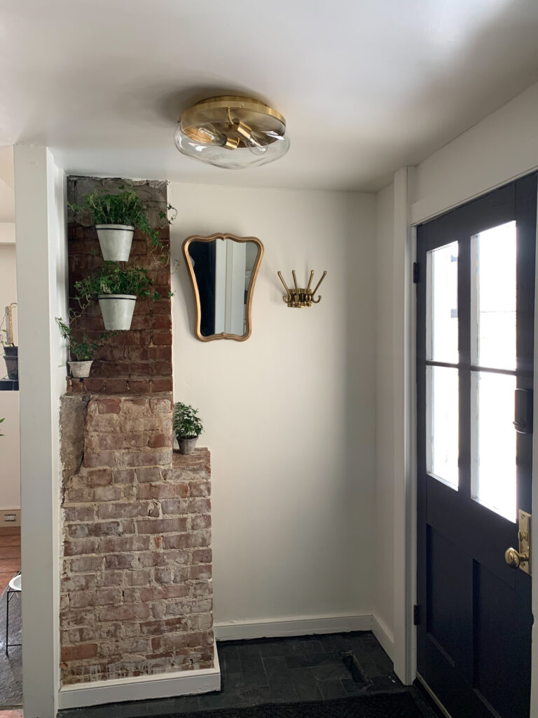
We weren’t looking to make this space super fancy, nor did we really have the room to expand. But it had to be practical and clean looking considering it’s on display from the kitchen. Adam removed all of the plaster so we could add insulation into all of the exterior walls. The window by the washer and dryer was shortened so part of it wasn’t stuck behind anything. We left the brick of the kitchen fireplace exposed and sealed, which I think is a nice earthy touch.
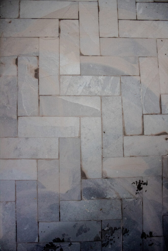
We added a gorgeous black slate tile in a straight herringbone pattern. My favorite pattern, but the space was too small to keep it on its traditional angle. Adam designed the perfect compromise by keeping it square, which is a little more traditional for the house as well. Yes, I will spend my entire life keeping it clean, but it’s all in the name of more black in my life!
Adam also added plumbing into the cabinet next to the washer where the dog’s bowls will eventually live (rather than in the kitchen fireplace currently). There are still a few more finishing touches ( antique shopping!) like a pretty umbrella holder, and some small touch ups that we will add. And knowing me, the space will evolve over time.
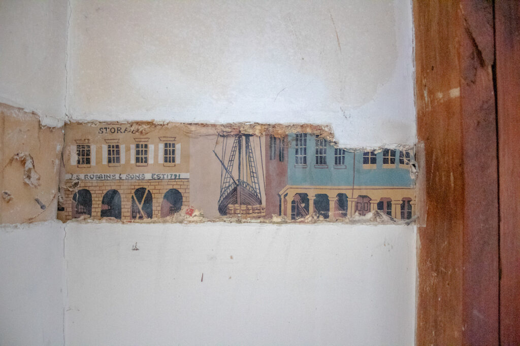
It was fun to find some cute wallpaper and other treasures – keys, the gift tag labeled wiring, though Adam was not impressed, animals (well, that wasn’t cute). Other than that, I won’t bore you with the details and just share some fun photos.
BEFORE
AFTER
PRODUCTS CREDITS –
WALL & TRIM PAINT: Sherwin Williams White Tail
DOOR PAINT: Benjamin Moore Twilight Zone
CEILING LIGHTS: IKEA
WALL HOOK: IKEA
WASHER/DRYER: GE
MIRROR: VINTAGE
TILE: Home Depot
ROMAN SHADE: JCPenney, Microchip Gray
CABINET HARDWARE: Home Depot
WALL PLANTER HOOK: Crate & Barrel
